

The PTE Bar Chart is a common visual format in the PTE Describe Image task. It presents information using bars and may compare different categories, countries, products, age groups, percentages, or other types of information.
You do not need to describe every number shown in the chart. Instead, focus on the main features, highest and lowest values, comparisons, and important differences. With a simple structure, you can speak continuously without unnecessary pauses.
A good response can follow this order:
Introduction → Overall trend → Key figures → Comparisons → Conclusion
How to Describe a PTE Bar Chart
First, identify what the bar chart is about. Look at the title, horizontal axis, vertical axis, categories, and units. Next, identify the highest and lowest figures and make one or two useful comparisons. Finally, summarize the main information clearly.
For more useful words and phrases, learn more about PTE Describe Image Vocabulary to improve your fluency and describe images more confidently.
A. Vocabulary for Increase
When a bar shows that a number or percentage has gone up, you can use different words instead of repeatedly using “increase.” For example, choose the word according to the size and speed of the change.
- rise – rose – will rise
- climb – climbed
- increase – increased
- grow – grew
- improve – improved
- leap – leaped
- soar – soared
- upward trend
- growth
Sentence Examples
The figure rose from 20 to 50.
Meanwhile, the number climbed gradually during the period.
Overall, the percentage soared from 30% to 70%.
B. Vocabulary for Decrease
When the figures move down, there are several useful words you can use. For instance, “dip” and “decline” usually describe a fall, while “plunge” and “slump” can describe a much larger decrease.
- fall – fell – will fall
- decline – declined
- drop – dropped
- dip – dipped
- decrease – decreased
- diminish – diminished
- slump – slumped
- plunge – plunged
- collapse – collapsed
- downward trend
Sentence Examples
The percentage dipped from 90% to 45%.
Similarly, the ratio of solar power consumption dropped slightly.
Meanwhile, the figure declined gradually over the period.
C. Synonyms for Highest
When one category has a greater figure than all the others, you can use different expressions to avoid repeatedly using “highest.” For example, useful alternatives include “largest,” “maximum,” “peak,” and “greatest,” depending on the context.
- largest
- maximum
- dominant
- peak
- biggest
- greatest
- predominant
Sentence Examples
The highest figure was recorded in 2023.
Meanwhile, the figure reached a peak of 75 in 2025.
Similarly, the largest proportion was recorded for young adults.
D. Synonyms for Lowest
When you want to describe the category with the smallest figure, several useful alternatives are available. For example, you can use “smallest,” “least,” or “minimum,” depending on the sentence.
- smallest
- least
- minimum
- lowest
- bottom
- base
Sentence Examples
The lowest figure was recorded in 2023.
By comparison, the smallest figure was recorded in 2021.
The category with the least number of participants was Group C.
E. Vocabulary for No Change
Sometimes, figures remain almost the same throughout a period. In this situation, you can describe them as stable, unchanged, or consistent.
- constant
- stable
- unchanged
- remain at the same level
- remain consistent
- stability
- level off
Sentence Examples
The figure remained stable throughout the period.
Similarly, the number remained at the same level.
However, after a sharp increase, the figure levelled off at around 60.
F. Language of Approximation
You do not always need to give an exact number when describing a bar chart. If a figure is difficult to read, approximation words can make your description more natural.
- around
- roughly
- nearly
- approximately
- just over
- just under
- about
- almost
- close to
Sentence Examples
The figure was around 50.
Meanwhile, the percentage increased to approximately 65%.
In addition, the number was just over 100.
⭐ Simple Structure to Follow
Introduction: Paraphrase what the chart shows.
Example: The bar graph compares __________________________.
Overall: Mention the highest and lowest figures and identify the main trend.
Body: Describe the key figures, important increases or decreases, and useful comparisons.
Conclusion: Briefly summarize the main information shown in the chart.
PTE Bar Chart Template 1: Basic Comparison
- The bar chart illustrates __________________.
- Overall, it is clear that __________________ was the highest, while __________________ recorded the lowest figure.
- Looking at the details, __________________ stood at approximately __________________, compared with __________________ at __________________.
- In addition, __________________ was higher/lower than __________________.
- Therefore, the chart clearly shows significant differences among the categories.
PTE Bar Chart Template 2: Highest and Lowest
- The given bar chart compares __________________ across different categories.
- Overall, __________________ had the highest value, whereas __________________ had the lowest.
- Looking at the figures, __________________ was approximately __________________, followed by __________________ at __________________.
- In contrast, __________________ recorded only about __________________.
- To conclude, the chart presents a clear difference between the highest and lowest categories.
Question 1: PTE Bar Chart Describe Image Example
In this task, you will see a visual such as a graph, chart, map, diagram, or picture. You have 25 seconds to prepare and then 40 seconds to speak about it. Instead of explaining everything, focus on the main features, important figures, and useful comparisons.
PTE Speaking Model Answer
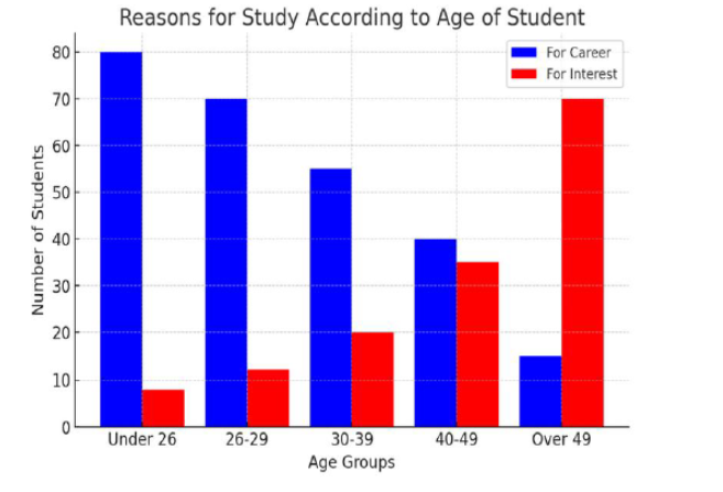
The bar graph illustrates —————————-.
Or, The horizontal axis displays ——– categories, and the vertical axis shows the ———-.
Or, In addition, blue bars represent ——-, while green bars indicate study for ——–.
Or, Overall, career purposes ——— steadily with age, whereas interest-based study shows the ——- trend and rises gradually.
Or, For example, among students under 26 age, 80% study for career, compared with only 10% for interest. By contrast, among students over-49 age, career drops to about —-%, while interest rises to around —-%.
Or, Therefore, younger students are focus on ———– purposes, while older learners are more interested in ———- purposes.
PTE Speaking Model Answer
The bar graph illustrates the reasons for study according to the age of students.
The horizontal axis displays five age categories, and the vertical axis shows the number of students.
In addition, blue bars represent study for career purposes, while red bars indicate study for interest.
Overall, career-focused study decreases steadily with age, whereas interest-based study shows the opposite trend and rises gradually.
For example, among students under 26 age, around 80 students study for career purposes, compared with only 8 students who study for interest. By contrast, among students over 49, career-focused study drops to about 15 students, while interest-based study rises to around 70 students.
Therefore, younger students are more focused on career purposes, while older learners are more interested in studying for interest.
Question 2: PTE Bar Chart Describe Image Example
In this task, you will see an image such as a graph, chart, map, diagram, or picture. You have 25 seconds to prepare and then 40 seconds to speak about it. Your goal is not to explain everything, but to give a clear and structure description.
PTE Speaking Model Template
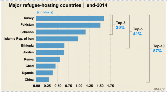
The bar chart illustrates —————————-.
Or, The horizontal axis represents —————-, while the vertical axis displays ————-.
Or, Overall, the highest figure was recorded for ————, at approximately ——–, followed by ———- with around ———-.
Or, In comparison, ———– and ———— recorded about ———– and ———- respectively.
Or, Meanwhile, the remaining categories had lower figures, with ————- recording the smallest number at approximately ————–.
Or, Therefore, ———- had the highest figure, whereas ———— recorded the lowest.
40-Second Response: Select any four sentences.
The bar chart illustrates the major refugee-hosting countries at the end of 2014.
Or, The horizontal axis represents the number of refugees in millions, while the vertical axis displays ten different countries.
Or, Overall, the highest figure was recorded for Turkey, at approximately 1.6 million, followed by Pakistan with around 1.5 million.
Or, In comparison, Lebanon and the Islamic Republic of Iran recorded about 1.2 million and 1 million respectively.
Or, Meanwhile. the remaining categories had lower figures, with China recording the smallest number at approximately 0.3 million.
Or, Therefore, Turkey had the highest figure, whereas China recorded the lowest.
1 thought on “PTE Bar Chart: How to Describe It With Numbers and Comparisons”