
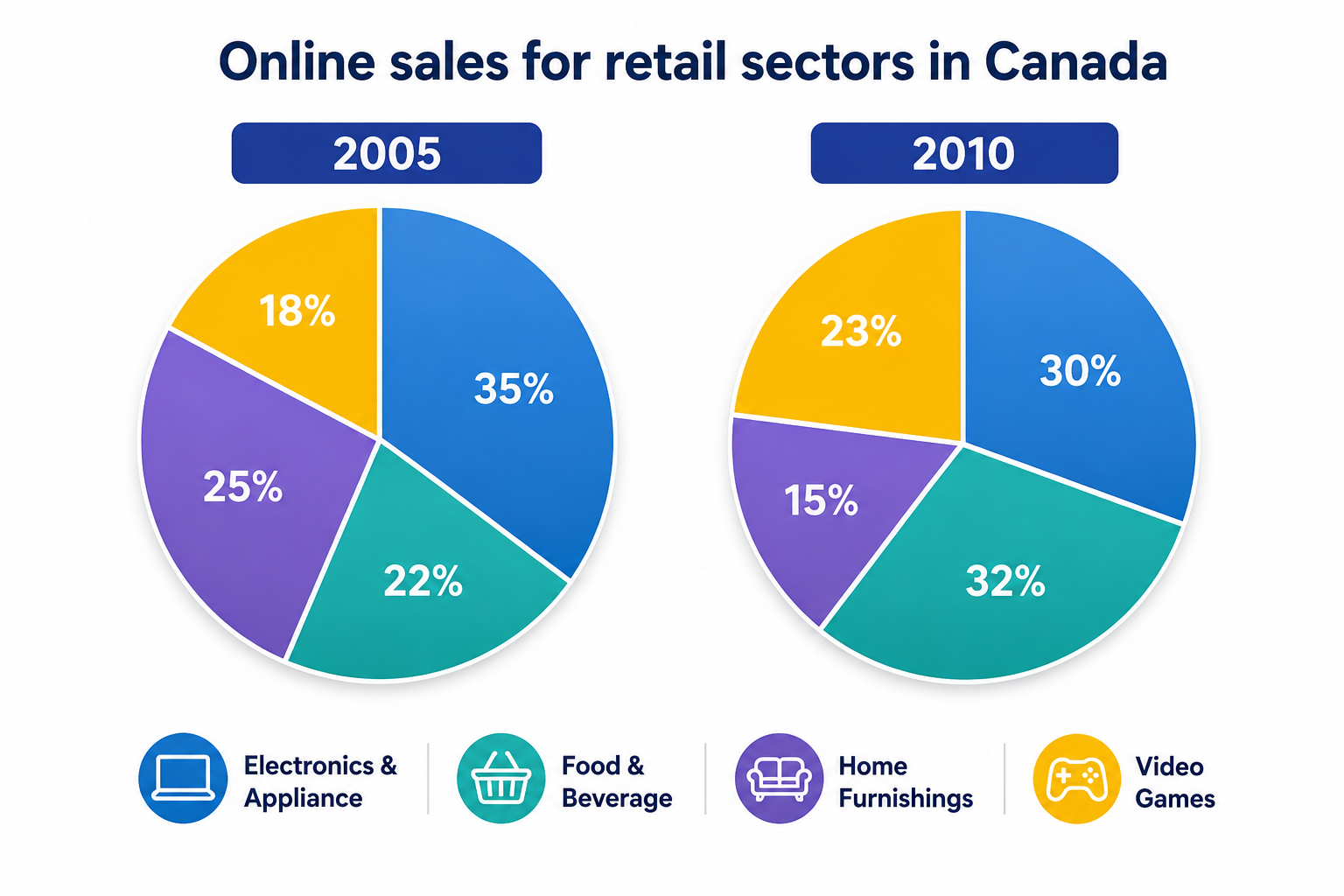

A PTE Pie Chart is a common visual task in the PTE Speaking section. It usually contains several sections, with each section representing a percentage of the total. To begin with, identify the largest and smallest sections. Next, compare the other important figures and organize the information into a clear and structured response.
- Introduce the chart.
- Give an overall observation.
- Mention the largest section.
- Mention the smallest section.
- Compare two or three other sections.
- Finish with a short conclusion.
⭐ Most Useful Sentence Verbs
- illustrates
- accounts for
- represents
- constitutes
- indicates
- compares
- reveals
- consists of
- surpasses
- demonstrates
Sentence Examples
- For example, food represents approximately 25% of the overall household spending.
- Similarly, the pie chart compares the proportions of spending on five different categories.
- In addition, housing accounts for the largest proportion, at 35% of the total expenditure.
For example:
❌ Housing is 40%. Food is 25%. Transport is 15%.
✅ First, housing accounts for 40%, followed by food at 25%, while transport represents 15%.
Pie Chart Vocabulary Words
For more useful words and phrases, learn more about PTE Describe Image Vocabulary Words to improve your fluency and describe charts more confidently.
For the highest percentage:
- highest proportion
- largest share
- biggest percentage
- dominant category
- major proportion
- largest segment
- accounts for the highest percentage
For the lowest percentage:
- lowest proportion
- smallest share
- smallest percentage
- minor proportion
- least significant category
- smallest segment
- accounts for the lowest percentage
For comparisons:
- higher than
- lower than
- greater than
- less than
- compared with
- in comparison with
- whereas
- while
- followed by
- respectively
For describing similarities:
- similar proportion
- almost the same
- relatively similar
- comparable share
- equal proportion
- approximately the same
For describing differences:
- significant difference
- considerable difference
- noticeable difference
- slight difference
- substantial gap
- major variation
For concluding:
- overall
- in general
- to sum up
- in conclusion
- it is clear that
- the chart clearly shows
- the most noticeable feature is
Question 1: Single Pie-Chart in PTE Describe Image
In this task, you will see an image such as a graph, chart, map, diagram, or picture. You have 25 seconds to prepare and then 40 seconds to speak about it. Your goal is not to explain everything, but to give a clear and structured description.
PTE Describe Image Template 1
- The pie chart represents the ————————————.
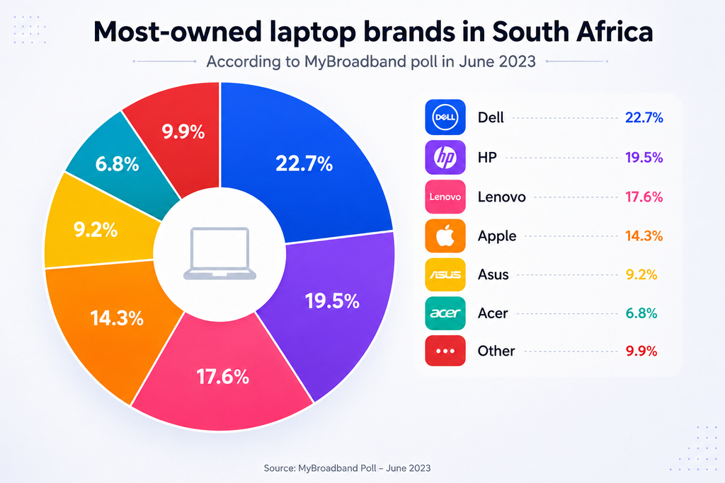
- According to the chart, Dell was the most widely owned laptop brand, with ——–. This was followed by ————– at 19.5%, while ———— secured third place with ——– of ownerships.
- In addition, Apple accounted for ——- of laptop ownership. Meanwhile, Asus and Acer held ——- and ————— of the market respectively. The remaining ———— represented —–.
- Overall, this data highlighted that ——–,———, and——— dominated the South African laptop market, making up nearly 60% combined.
40 Seconds Response:
The pie chart represented the most-owned laptop brands in South Africa, according to a MyBroadband poll conducted in June 2023.
According to the chart, Dell was the most widely owned laptop brand, with 22.7%. This was followed by HP at 19.5%, while Lenovo secured third place with 17.6% of ownership.
In addition, Apple accounted for 14.3% of laptop ownership. Meanwhile, Asus and Acer held 9.2% and 6.8% of the market respectively. The remaining “Other” category represented 9.9%.
Overall, the data highlighted that Dell, HP, and Lenovo dominated the South African laptop market, making up nearly 60% combined.
Question 2: Double Pie-Chart in PTE Describe Image
In this task, you will see an image such as a graph, chart, map, diagram, or picture. You have 25 seconds to prepare and then 40 seconds to speak about it. Your goal is not to explain everything, but to give a clear and structured description.
PTE Describe Image Template 2
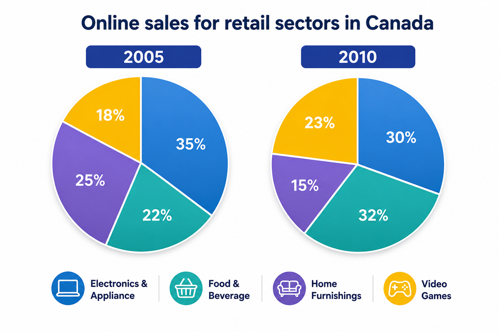
- The two pie charts compare ———————————- four sectors from 2005 to 2010.
- Overall, [category] had the highest percentage in [year 1], whereas [category] became the largest in [year 2].
- In [year 1], [category 1] accounted for [X]%, followed by [category 2] at [Y]%. [Category 3] and [category 4] represented [Z]% and [A]%, respectively.
- By [year 2], [category 1] had increased/decreased to [B]%, while [category 2] had risen/fallen to [C]%. Similarly, [category 3] changed from [X]% to [Y]%.
- In conclusion, the charts showed noticeable changes in ————————.
40 Seconds Response:
The two pie charts illustrated the online sales for different retail sectors in Canada in 2005 and 2010.
Overall, Electronics and Appliances had the largest share in 2005, at 35%, whereas Food and Beverage became the largest sector in 2010, at 32%.
In 2005, Home Furnishings accounted for 25%, followed by Food and Beverage at 22%, while Video Games represented 18% of online sales. In 2010, Electronics and Appliances decreased to 30%, whereas Food and Beverage increased to 32%. Similarly, Video Games rose from 18% to 23%, while Home Furnishings declined from 25% to 15%.
In conclusion, the charts showed noticeable changes in online sales, with Food and Beverage becoming the leading sector in 2010, while Home Furnishings experienced the most significant decline.