

A PTE Scatter Plot is a visual task in the PTE Speaking section that shows the relationship between two variables. For example, it may compare height and weight, study hours and examination scores, or exercise time and body weight. To begin with, identify the variables and axes. Then, look for the overall pattern, such as a positive, negative, weak, or unclear correlation.
A scatter plot is a graph that shows the relationship between two variables. For example:
- Height and weight
- Age and income
- Exercise time and body weight
- Study hours and examination scores
- Temperature and energy consumption
A. How to Describe a Scatter Plot?
In a scatter plot, the main objective is to identify and describe the relationship between two variables. Therefore, a scatter plot should be carefully analysed to identify the overall pattern and direction of the relationship.
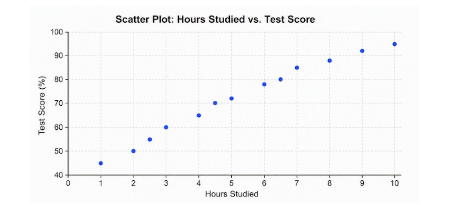
Therefore, the graph above illustrates a positive correlation between hours studied and test scores. A positive correlation means that when one variable increases, the other variable generally increases as well.
Useful Scatter Plot Vocabulary
For more useful words and phrases, learn more about PTE Describe Image Vocabulary Words to improve your fluency when describing graphs, charts, and other visual tasks.
- positive correlation
- negative correlation
- increases
- decreases
- weak correlation
- no clear relationship
- slight relationship
- inverse relationship
Sentence Examples
- The scatter plot shows a positive correlation between hours studied and test scores.
- The graph shows a negative correlation between exercise time and body weight.
- The graph indicates a weak correlation between income and working hours.
Question 1: PTE Describe Image Scatter Plot
In this task, you will see an image such as a graph, chart, map, diagram, or picture. You have 25 seconds to prepare and then 40 seconds to speak about it. Your goal is not to explain everything, but to give a clear and structured description.
PTE Describe Image Template 1
- The graph illustrates a scatter plot showing ———————–.
- Or, Overall, it shows a —————————-.
- Or, The horizontal axis represents ———–, while the vertical axis shows ———-.
- Or, There is a ——– correlation, as test scores increase with —————-.
- Or, The lowest score is ————-, whereas the highest score ——————.
- Or, The scores increase steadily from about ————– to ———————.
- In conclusion, the graph indicates —————————-.
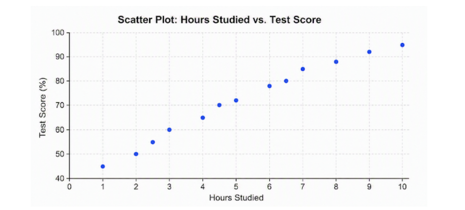
40 Seconds Response: The graph illustrates a scatter plot showing the relationship between hours studied and test scores. Overall, there is a positive correlation, as test scores increase with the number of hours studied. The lowest score is 45% after 1 hour of study, whereas the highest score is 95% after 10 hours. In conclusion, the graph indicates that students who study for more hours generally achieve higher test scores.
Question 2: PTE Describe Image Scatter Plot
In this task, you will see an image such as a graph, chart, map, diagram, or picture. You have 25 seconds to prepare and then 40 seconds to speak about it. Your goal is not to explain everything, but to give a clear and structured description.
PTE Describe Image Template 1
- The graph illustrates a scatter plot showing ———————–.
- Or, Overall, it shows a —————————-.
- Or, The horizontal axis represents ———–, while the vertical axis shows ———-.
- Or, There is a ——– correlation, as test scores increase with —————-.
- Or, The lowest score is ————-, whereas the highest score ——————.
- Or, The scores increase steadily from about ————– to ———————.
- In conclusion, the graph shows —————————-.
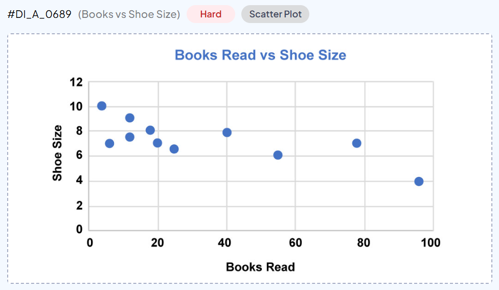
40 Seconds Response: The scatter plot illustrates the relationship between books read and shoe size. The horizontal axis represents the number of books read, while the vertical axis shows shoe size. The highest shoe size is 10, with around 5 books read, whereas the lowest shoe size is 4, with approximately 96 books read. In conclusion, the graph shows an inverse relationship between books read and shoe size.
B. BMI Chart in PTE Describe Image
A BMI chart shows Body Mass Index categories, which are commonly which are calculated using a person’s weight and height. A BMI chart may present information using categories such as:
- Underweight
- Healthy weight
- Overweight
- Obesity
How to describe BMI Chart?
In a BMI chart, the main objective is to assess an individual’s body weight relative to their height to determine whether they fall into a healthy weight range or face potential health risks.
Useful BMI Chart Vocabulary
- Colour-coded
- Body Mass Index (BMI)
- Range
- Lean Body Mass
- Fat Mass
- Threshold
- Classification
- Colour-coded grid
- Feet, Centimetres, Pounds and Kilograms
Sentence Examples
- A healthy BMI typically falls within the target range of 18.5 to 24.9.
- The chart clearly highlights several numerical thresholds, ranging from 18.5 for underweight to over 40 for severe obesity.
- The chart compares height, measured in feet and centimetres, while weight, measured in pounds and kilograms.
Question 1: PTE Describe Image BMI Chart
In this task, you will see an image such as a graph, chart, map, diagram, or picture. You have 25 seconds to prepare and then 40 seconds to speak about it. Your goal is not to explain everything, but to give a clear and structured description.
PTE Describe Image Template 1
- The chart illustrates ————–, showing the relationship between ———-.
- Or, It is divided ———————————–, and ———–.
- Or, As ———- increases/decreases, ————- range also increases/decreases.
- Or, The chart uses different colors to distinguish each BMI category: —————————-.
- Or, The BMI thresholds are marked at —————-.
- Overall, the charts indicates —————————-.
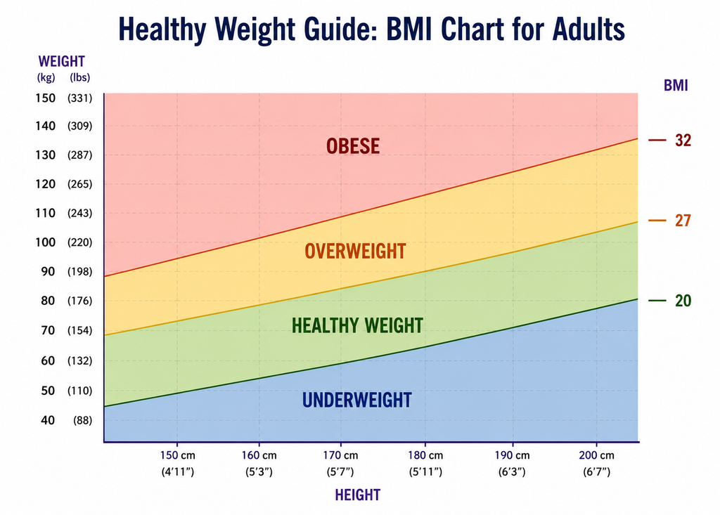
40 Seconds Response: The chart illustrates a BMI chart for adults, showing the relationship between height and weight. The chart uses different colors to distinguish each BMI category: underweight represent blue, healthy weight represents light green, overweight represents yellow, and obese represents pink. As height increases, the healthy weight range also increases gradually. Overall, the chart presents the relationship between height, weight, and different BMI categories at 20, 27 and 32.
Question 2: PTE Describe Image BMI Chart
In this task, you will see an image such as a graph, chart, map, diagram, or picture. You have 25 seconds to prepare and then 40 seconds to speak about it. Your goal is not to explain everything, but to give a clear and structured description.
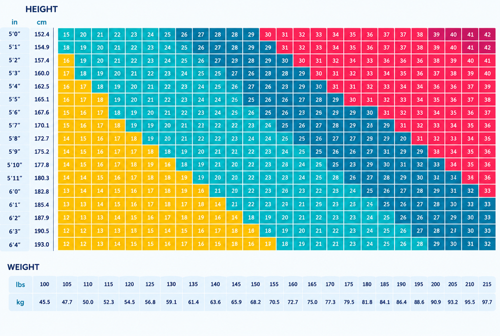
PTE Describe Image Template 1
- The chart illustrates ————–, showing the relationship between ———-.
- Or, It is divided into ———————————–, and ———–.
- Or, As ———- increases/decreases, ————- range also increases/decreases.
- Or, The chart uses different colors to distinguish each BMI category: —————————-.
- Or, The BMI thresholds are marked at —————-.
- Overall, the charts indicates —————————-.
40 Seconds Response: The chart illustrates BMI-related values, showing the relationship between height and weight by a colour-coded grid. It is divided into different height and weight ranges, with highest values are mainly found toward the upper-right section, whereas lower values appear mostly in the lower-left area. The chart uses different colors to distinguish each BMI category, including yellow, green, blue, and red. Overall, the chart compares height, measured in feet and centimetres, while weight, measured in pounds and kilograms.